A Maximalist Wedding at The Cape, Cabo
Some weddings need a lot of explanation to understand the design. This one really doesn’t.
The couple wanted a maximalist wedding, and they were not afraid of the word maximalist. They wanted the spaces to feel full, layered, and completely dressed for the occasion. So instead of trying to edit the design down, we leaned into it.
The color palette was clear from the beginning: blue and white, with gold accents. From there, we played with different shades of blue, patterned textiles, lush florals, crystal, custom stationery, and plenty of personalized details.
The ceremony and reception also had very different personalities, even though they were clearly part of the same wedding.
The ceremony
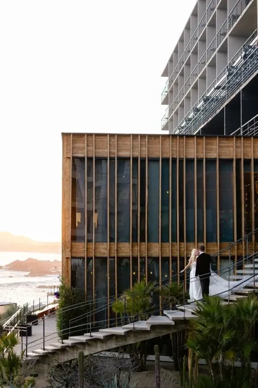
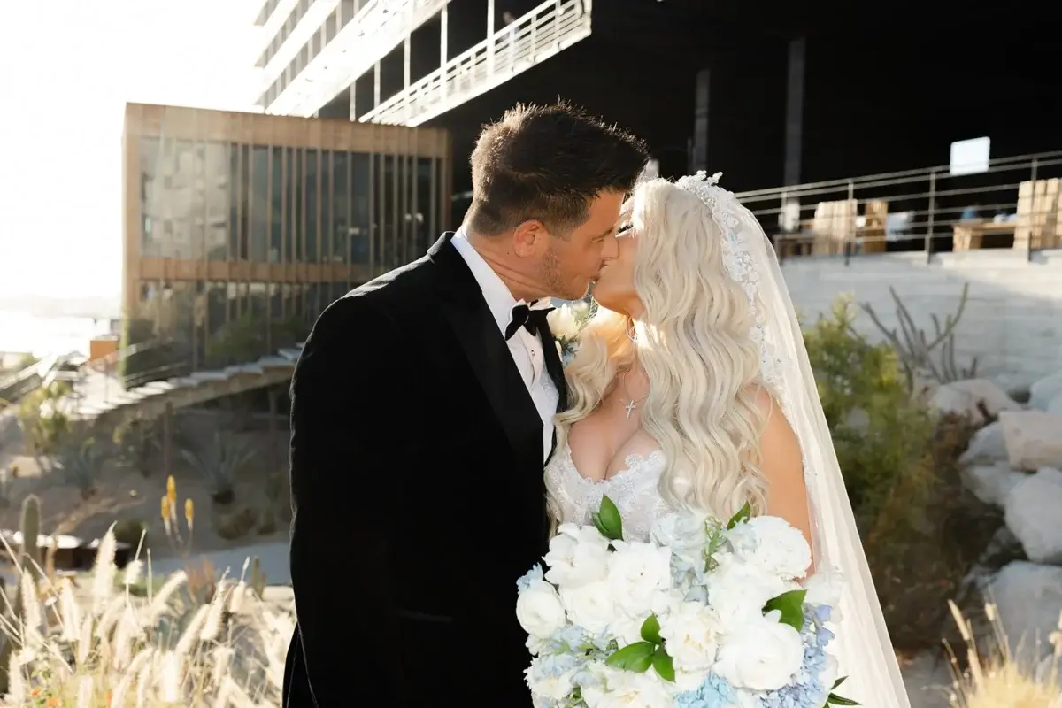
The Christian ceremony took place at the gorgeous lobby terrace, with the Arch of Cabo San Lucas creating an incredible natural backdrop, but a spectacular view doesn’t mean the design should disappear.
In fact, we feel the opposite: the more extraordinary the setting, the more thoughtful the design needs to be. An elevated ceremony overlooking the ocean needs an altar with enough presence to hold its own against that scenery; not compete with it but become part of the composition.
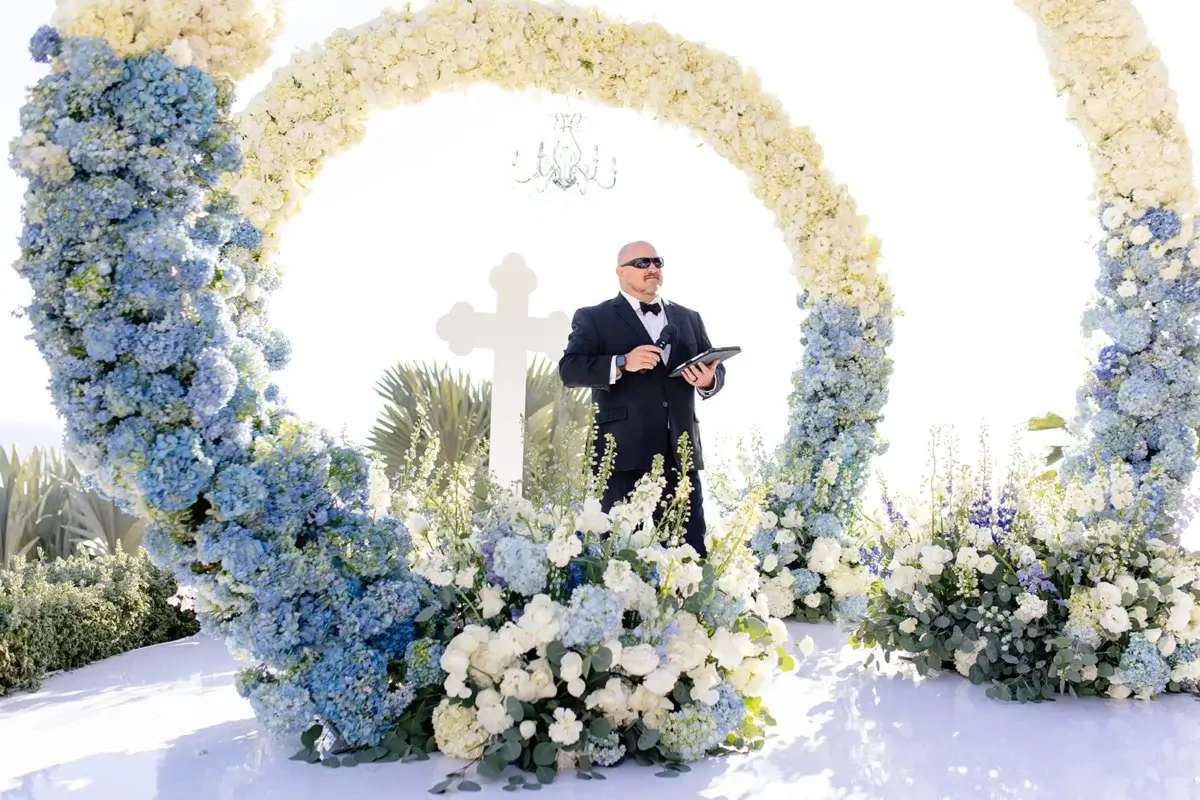
The ceremony location had an irregular shape, which meant that a standard altar or stage was never going to be the right solution. We designed the entire production specifically for the space, including a custom-built stage, a tailor-made cross, and an aisle runner created to follow the exact layout of the ceremony.
The altar was then built up with an abundant blue-and-white floral installation, giving the ceremony a strong visual focal point from every angle.
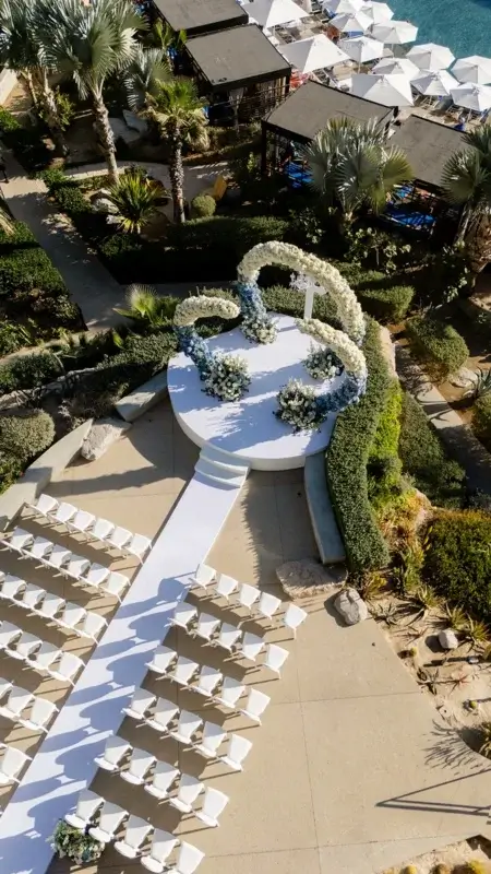
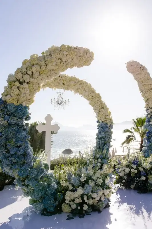
Our job was to create an altar that felt substantial enough for the setting, personal enough for the couple, and cohesive enough to connect with everything that would follow at the reception.
The reception
The reception took place on the Glimpse Terrace at The Cape, Cabo, and this is where the maximalist part of the design really took over.
The first thing you noticed was the ceiling.
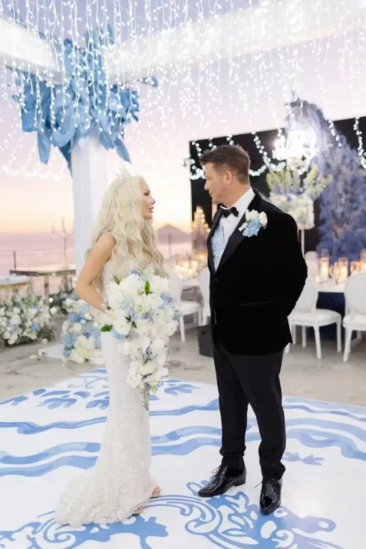
A full canopy of white twinkle lights covered the reception area, framed by white structural pillars around the dance floor. It changed the terrace completely once the sun went down.
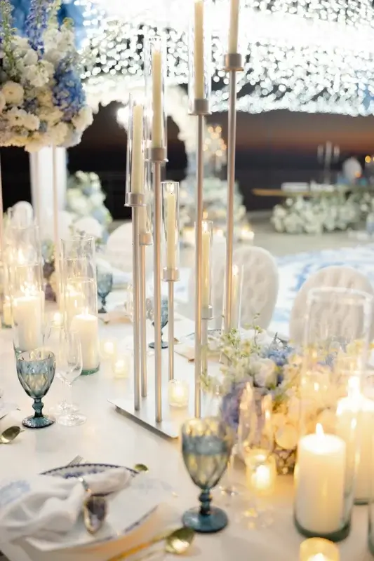
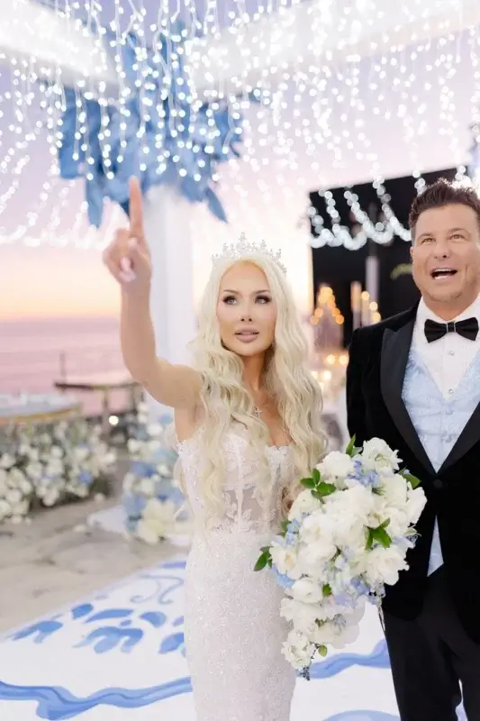
Underneath, we mixed several different table configurations.
The long white serpentine tables curved through the reception, while round tables were dressed in white-and-blue patterned linens.
Above the serpentine tables, crystal chandeliers hung from a custom overhead structure filled with blue feathers.
That combination was one of my favorite parts of the design.
The crystal brought the sparkle. The feathers brought movement and softness. The white kept it clean enough that all the blue could really stand out.
And then, of course, there were the flowers. Lots of them!!!
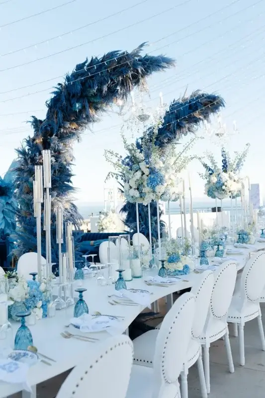
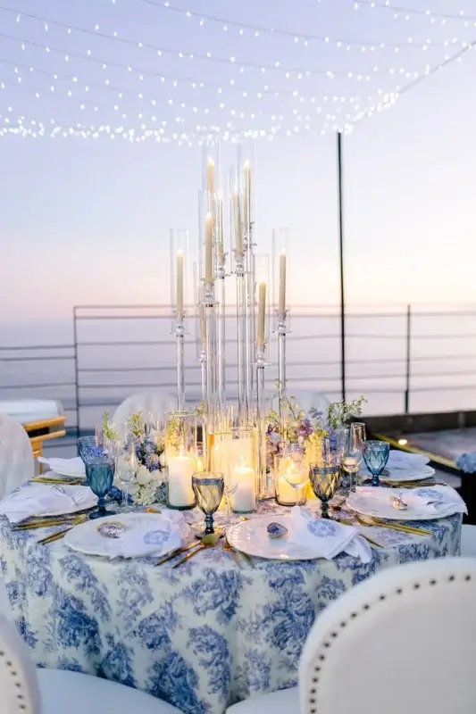
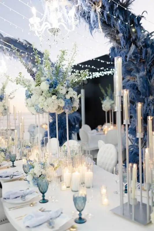
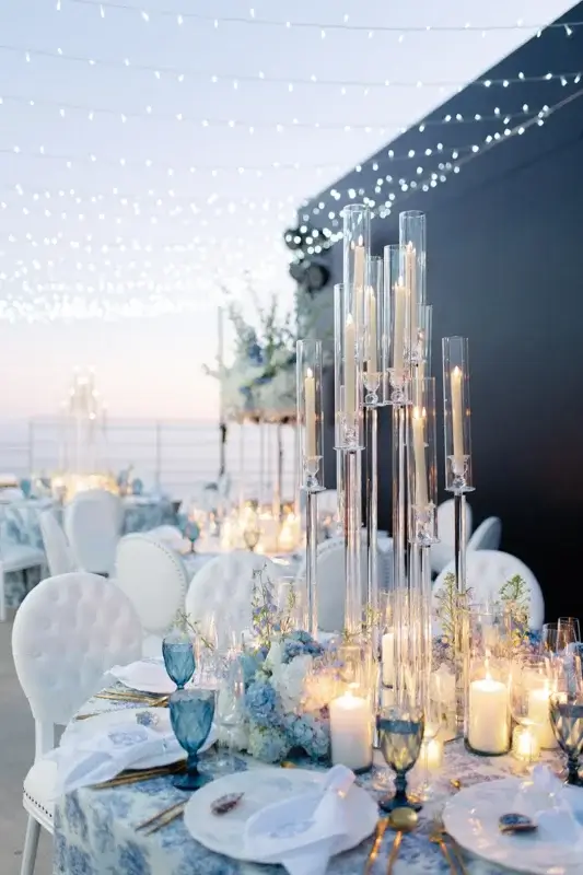
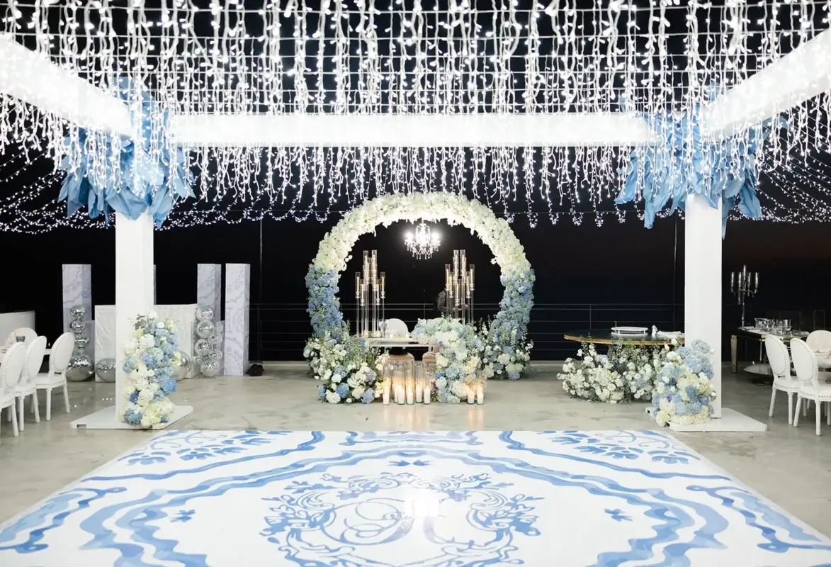
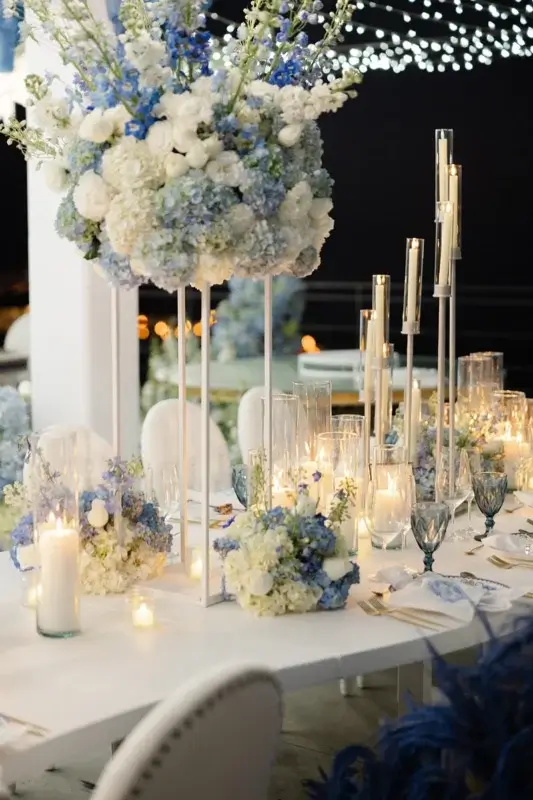
The floral design was intentionally lush and abundant. Flowers appeared on the tables, around the reception areas, and throughout the different installations. We weren’t trying to make the flowers look minimal or “effortless.”
They were supposed to be there. And there were supposed to be a lot of them.
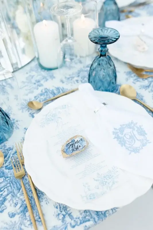
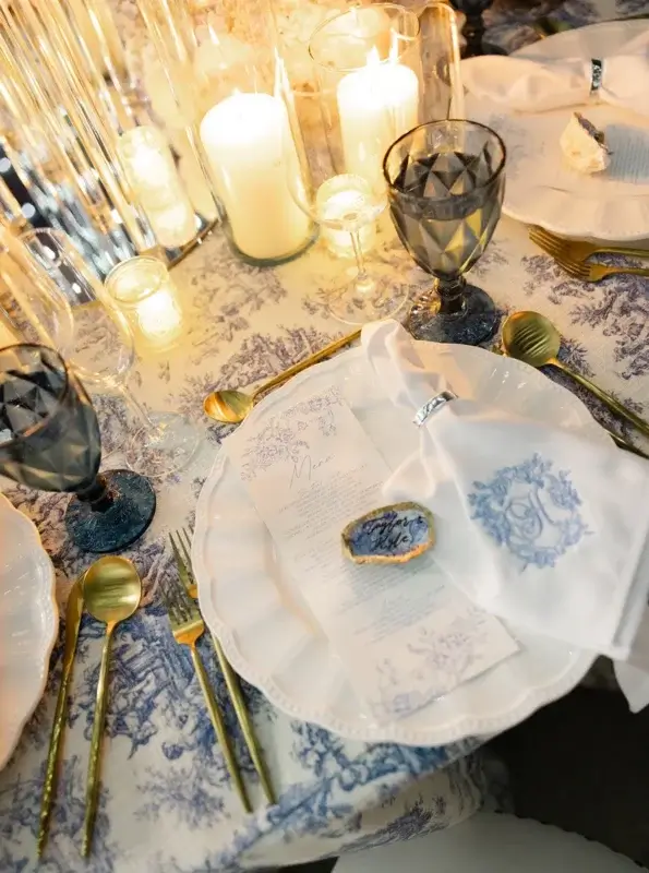
We kept the blue-and-white story going all the way down to the place settings
One of the things I enjoy most about a maximalist design is that you can keep discovering details.
The tables had gold cutlery, blue goblets, patterned linens, custom printed menus, and napkins embroidered with the couple’s last name initial.
For the place cards, we used handwritten oyster shells.
I loved that detail because it was completely different from the more formal elements around it. Among all the crystal, gold, printed stationery, and flowers, these little oyster shells brought in something much more natural and connected to the destination

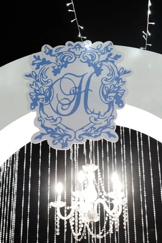
The lounge had another big personalized moment: a large printed monogram featuring the couple’s last name initial.
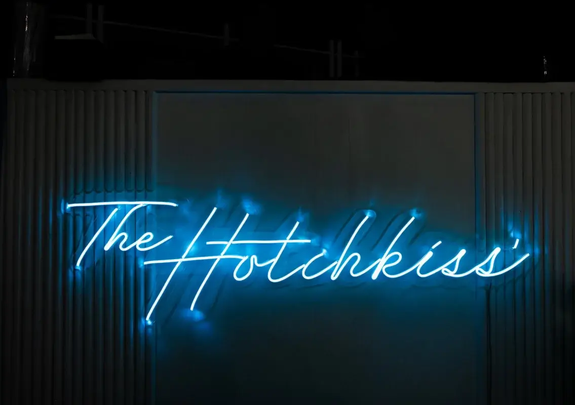
And we didn’t stop there.
The couple’s monogram was also incorporated into the dance floor, but not as a simple set of initial in the middle. It was turned into a much more intricate, full design that became part of the floor itself.
That is the kind of personalization that makes sense to us: taking something that belongs to the couple and actually making it part of the design, rather than simply putting their monogram on a few pieces of stationery.
The ceiling, the dance floor, and everything around them.
Once the dancing started, the reception took on a completely different feel.
The DJ booth was custom-designed as well, so it didn’t look like a piece of technical equipment that had simply been brought into the room. It followed the same design language as the rest of the reception.
This is one of those things that can easily be overlooked when planning a wedding.
A DJ booth has to be there, speakers have to be there, bars, technical equipment, stages, lighting, and production structures all have to be there.
But they don’t have to look like they were simply dropped into the middle of the décor.
We wanted everything visible to the guests to feel like it belonged.
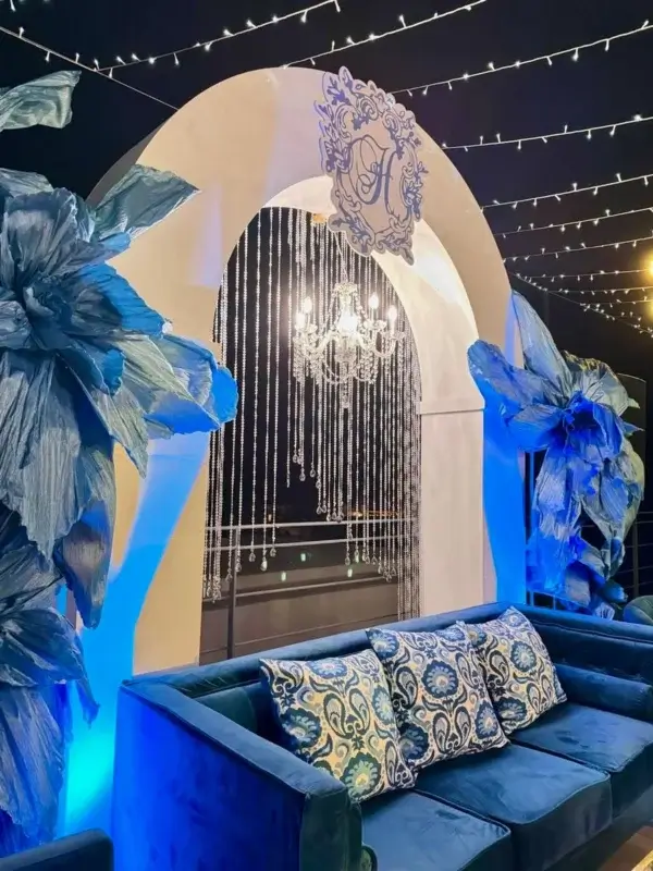
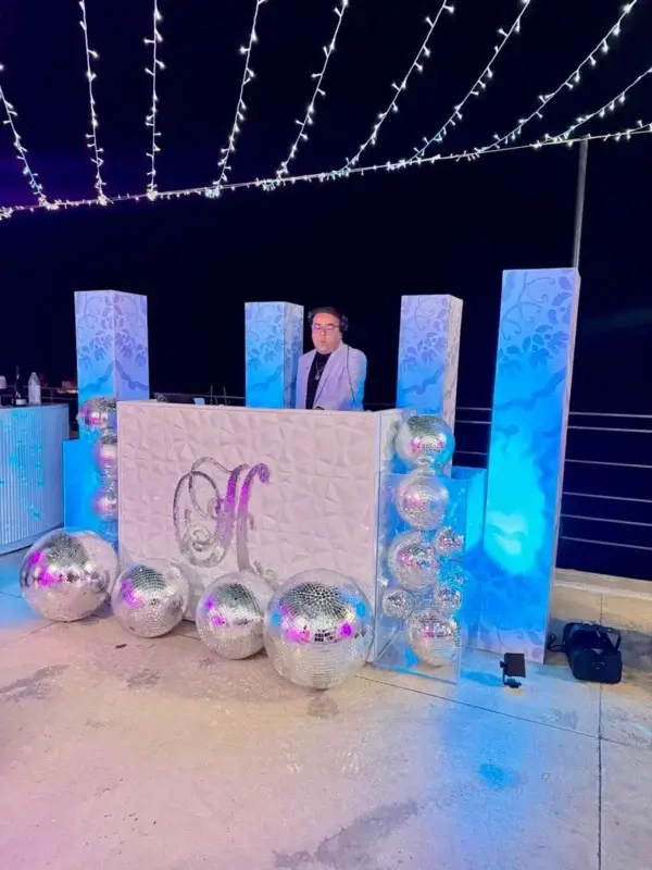
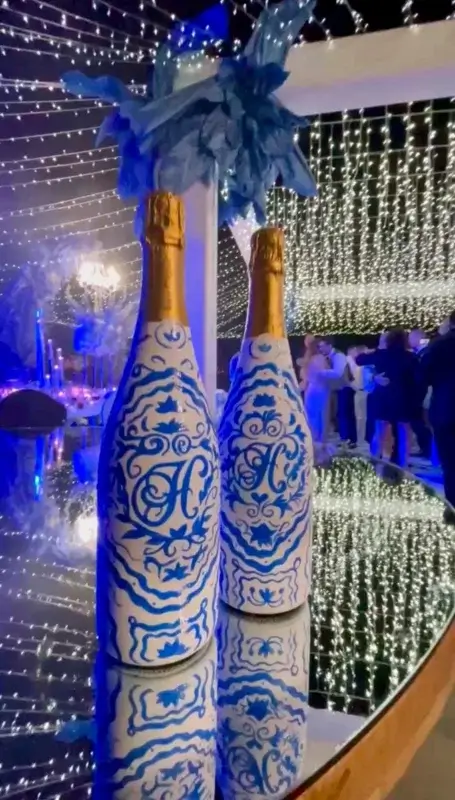
And then things got fun: The décor was only part of maximalism. During dinner, live dancers appeared as a surprise happening, bringing a completely different energy to the tables.
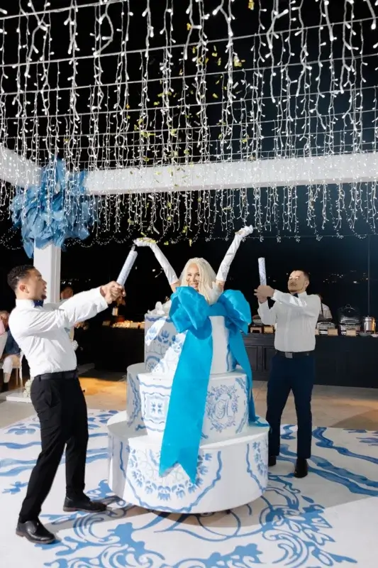
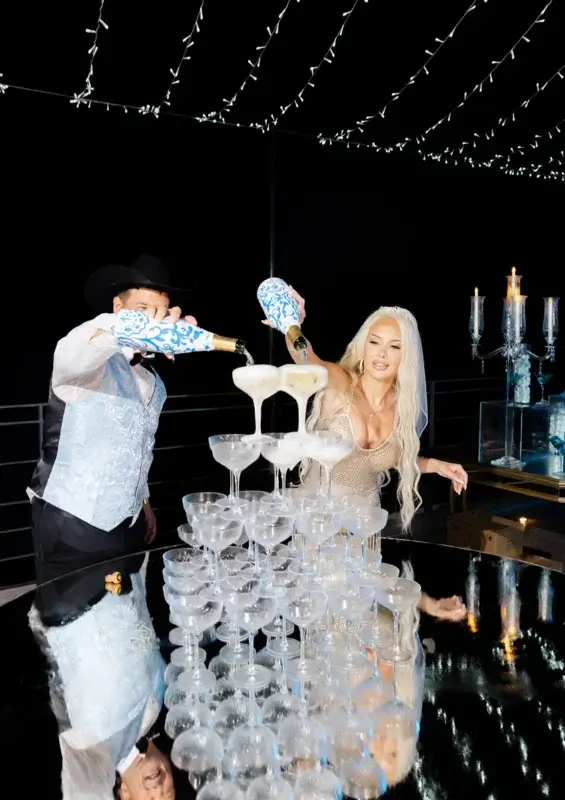
There was a champagne tower, There was a four-tier wedding cake, And then the bride surprised the groom by appearing from a structure designed to look like a three-tiered cake.
Because apparently a four-tier cake wasn’t enough.
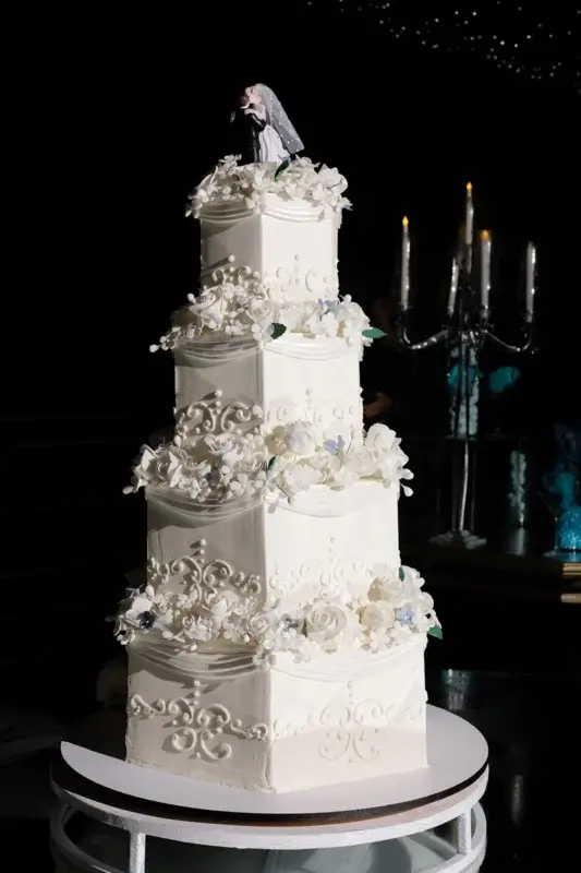
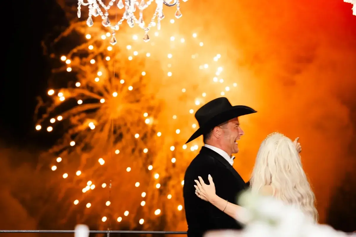
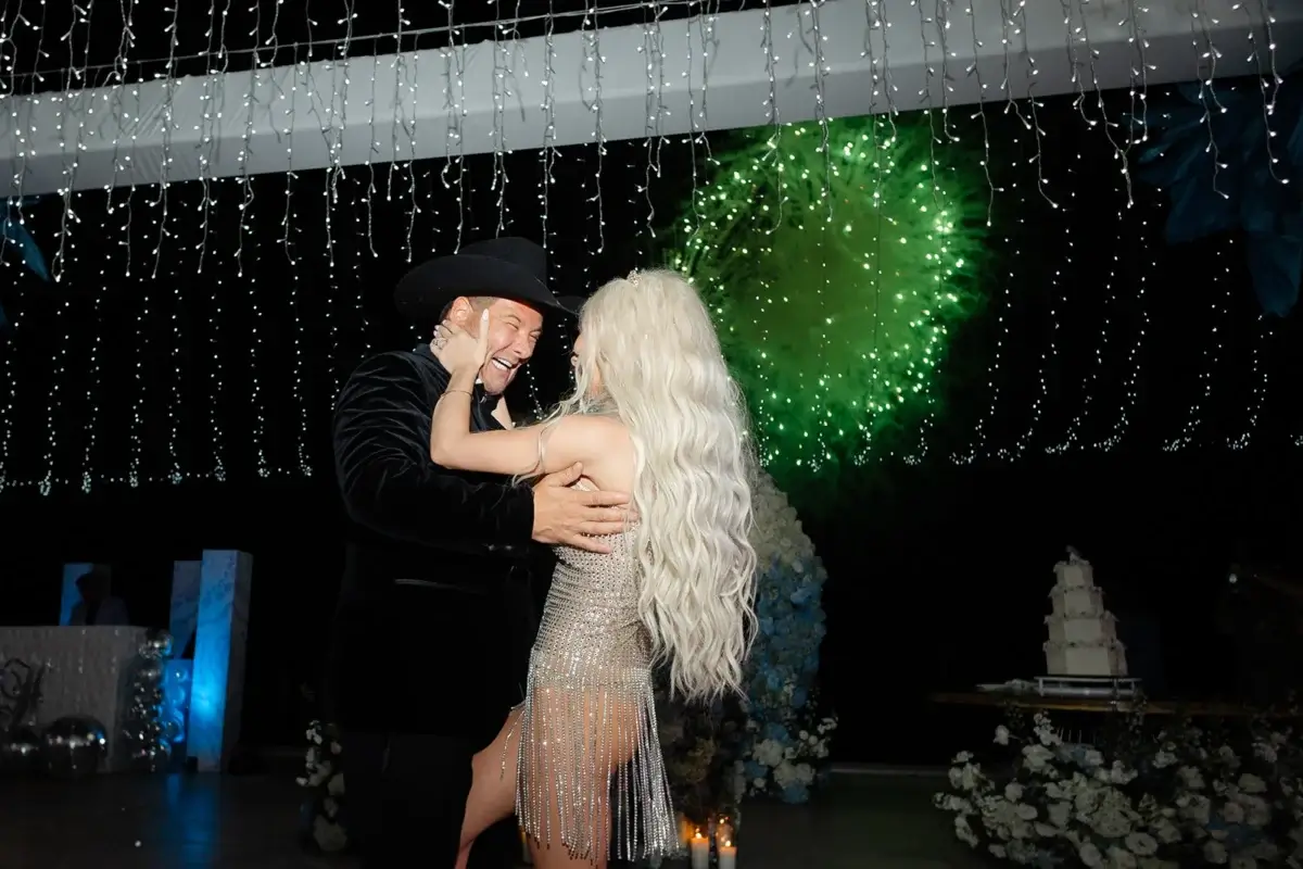
And just when the night seemed to have reached its peak, there were fireworks.
After all of that, we could have ended the night with something equally elaborate.
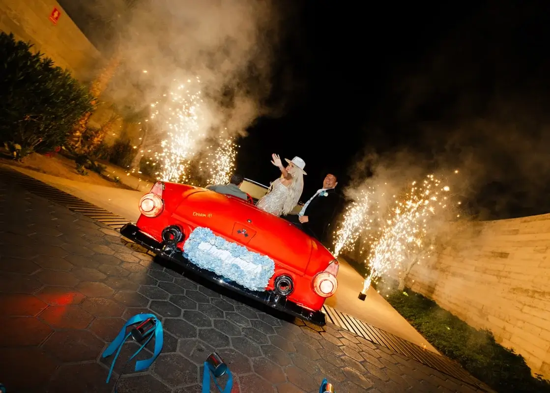
Instead, the couple left in a 1955 classic Thunderbird.
The car was framed by cold sparklers, creating a tunnel of light as they drove away.
It was a very different kind of statement from the reception but somehow a perfect one.
Classic car. Cabo night. Sparklers. No explanation needed.
So, what does maximalism actually look like?
For us, this wedding is a good example of why maximalism isn’t simply about adding more things. It is about being comfortable with different elements existing together:
Pattern next to pattern.
Blue next to blue.
Flowers next to crystal.
Feathers next to chandeliers.
Gold next to white.
A giant monogram next to a handwritten oyster shell.
And making all of it feel like it belongs to the same wedding.
This couple gave us plenty to work with, and we had a lot of fun with it.
The final result was not meant to be quiet. It was meant to be full. And it surely was.